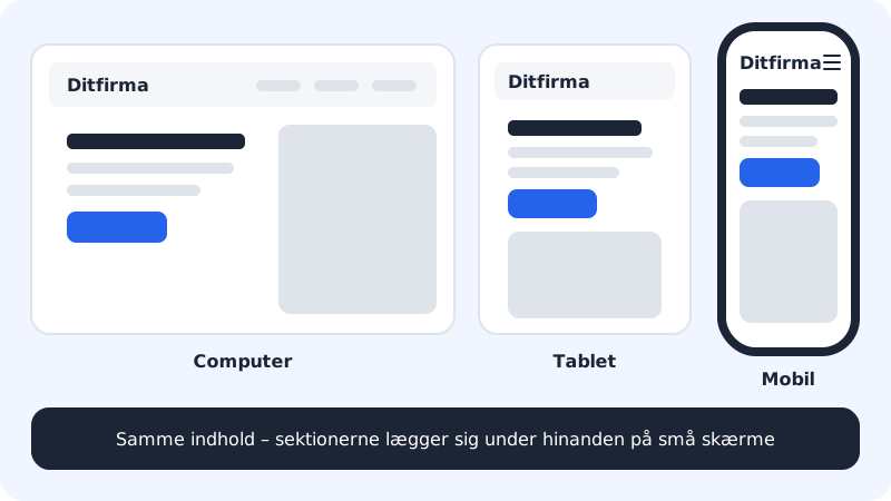
All sections in the website builder are mobile-friendly from the start. On small screens, text and images stack on top of each other, and the menu becomes a menu icon. You don't need to make a separate mobile version, but it's a good idea to look through the page at mobile width before you publish.
Check the mobile view
Step 1: Switch to Mobile
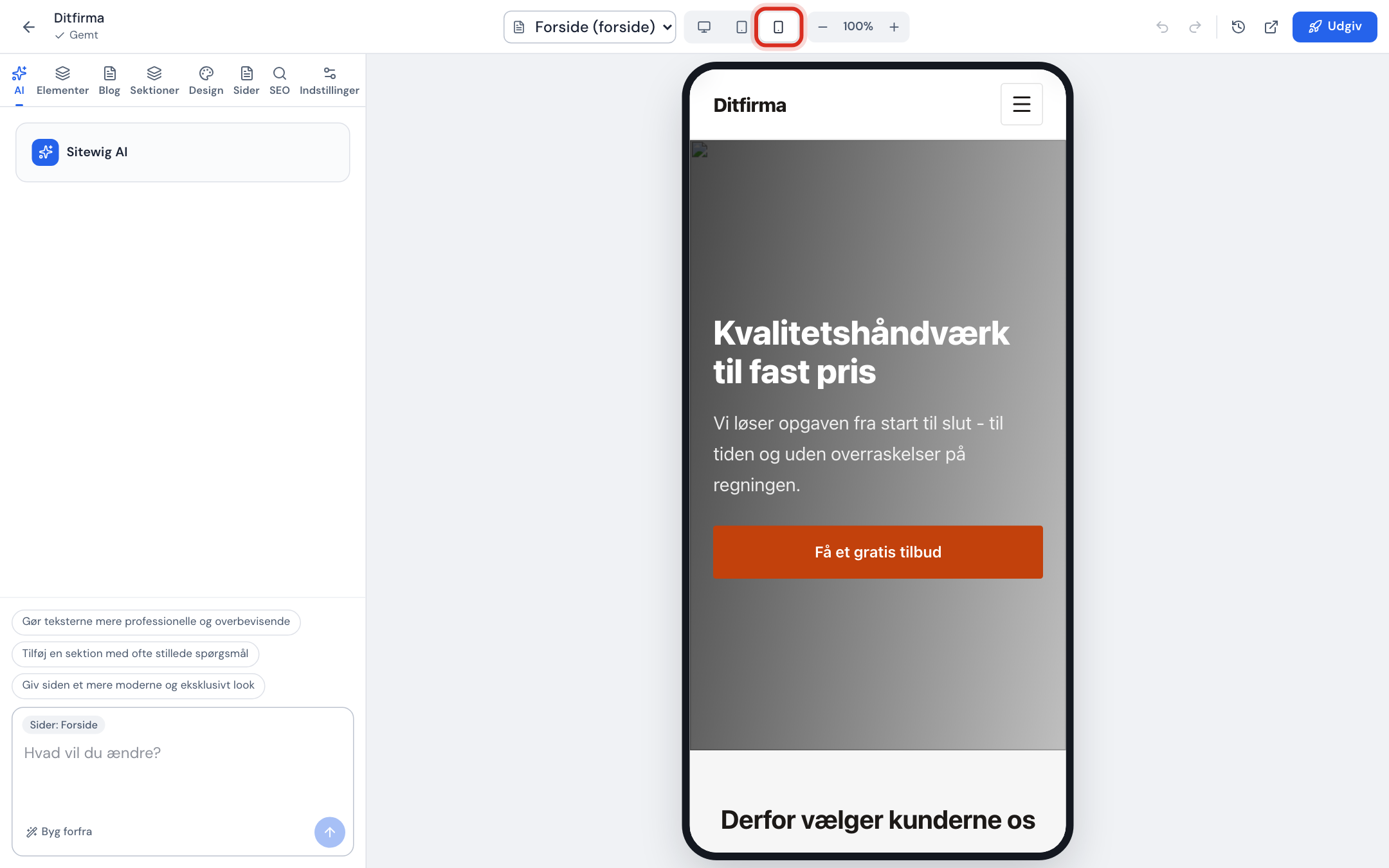
Click the phone icon (Mobile) in the top bar. The preview switches to mobile width. Tablet and Computer are right next to it.
The preview at mobile width Step 2: Go through all the pages
Use the page selector in the top bar and scroll through each page from top to bottom.
Step 3: Fix whatever takes up too much space
Long headings and button texts take up a lot of room on a phone. Click the text and shorten it. You can split long lists up, or hide a section that isn't important.
Step 4: Try it on your own phone
Once you've published, open the address on your own phone. It's the most honest test, e.g. of how buttons and phone numbers work.
Mobile view per section
Under Mobile view in a section you choose whether the section should be shown on mobile, tablet and computer (Show on mobile, Show on tablet, Show on computer), and you can make the text smaller on mobile with Font size on mobile. The section must be shown on at least one device – use Hide section if it should be hidden completely.
Tips for mobile
- Keep headings short, ideally under 6–8 words.
- Use images where the important part is in the middle. Images are cropped differently on mobile and computer.
- Write the phone number in the footer as a
tel:link, so customers can call with one tap. See Logo, favicon, footer and social media. - Keep the website light – large images make the page slow on mobile networks.
Frequently asked questions
Can I edit the website from my phone?
Yes. The editor works on the phone too. The tabs are in a bottom menu, and the Settings tab is called More on mobile. For bigger changes, a computer is easier.
Why does the page look different on my phone from in the editor?
Phones have different widths, and the system text size may be increased. Also check that you've published your latest changes.
Can I have a completely different home page on mobile?
No. Mobile, tablet and computer show the same website. That's also what Google prefers.